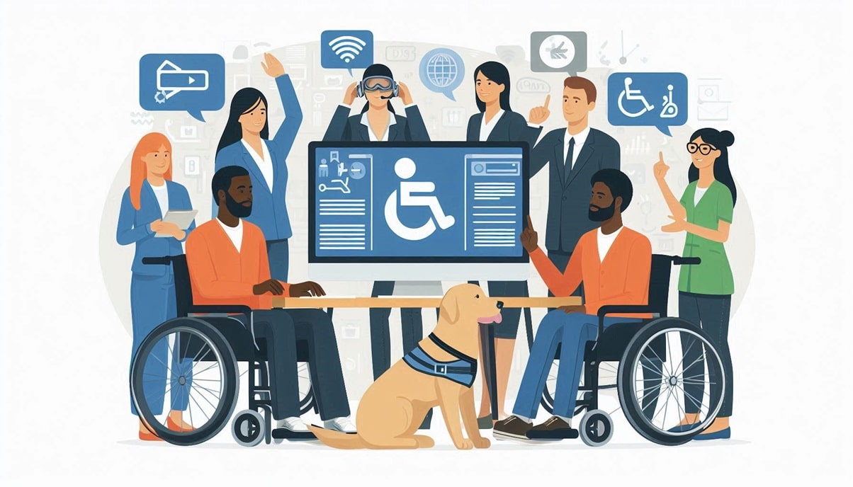
Test your website for accessibility
Not everyone has the same opportunities, and daily life naturally takes place on the Internet. Your goal as a website administrator is of course to make your website and the content it contains accessible to as many people as possible. It's up to you to take some disabilities into account when doing so. In this blog post, we'll look at how you can make your website as accessible as possible and what other steps you can take to test it!
To test your website for accessibility, you can use the following websites to find out more. Ismijnsitetoegankelijk.nl https://validator.w3.org/ https://checkers.eiii.eu/en/pagecheck2.0/ Here you can test per URL whether your website can be used by everyone and what tips you can use to improve this. The online tests are a good start to determine whether your website is user-friendly, and for each point on the checklist below you can delve deeper into the matter to make your website even more user-friendly for people with disabilities.
Further accessibility checklist
If you want to go one step further and check whether your website is accessible for each item, you can consider the following factors: Alt texts for images:
Add descriptive alt texts to each image. Accessible navigation: Make sure all buttons and links are keyboard accessible. Sufficient contrast: Ensure a good contrast ratio between text and background (at least 4.5:1). Legible fonts:
Use simple, easy-to-read fonts and a minimum size of 16 px. Sufficient white space: Create an overview by leaving sufficient margins between text and elements. Semantic HTML: Use headings and suitable HTML tags for structuring. Form fields with labels: Link each input field with a unique <label>.
Scalability: Ensure that the website can be easily zoomed to 200%. Screen reader support: Use ARIA labels and semantic HTML for screen readers. Use of colors: Don't just use colors to convey information, add text or icons. Subtitles and transcripts:
Add subtitles or transcripts to videos and audio content. No automatic time limits:
Avoid time-limited content or give users control over time. Keyboard focus: Provide a visible focus indicator in keyboard navigation. Alternatives to interactions:
Offer alternatives to functions such as drag and drop. Avoid conspicuous elements:
No rapidly flashing images to minimize the risk of epilepsy. WCAG compliance: Comply with WCAG 2.1 guidelines (level A or AA).
Consider providing text in audio format
For many websites, text makes up the majority of the layout and content, so it's worth considering making it available in audio format too. All you often need is a good microphone and the will to record the text. There are tools that can read these out automatically or with AI for people with disabilities, but of course it is much more personal to do this with your own voice.
This way, you can offer exactly the extra step that people with disabilities appreciate, without making them feel excluded. You can then host the audio yourself on your own hosting and make it available, but you can also host it with a third party and embed it on your website. Longer texts can be converted into a podcast format in this way, which in turn can find its own audience on third-party websites such as Spotify.
Offer multiple contact options
For many, it's also a godsend to offer multiple contact options on a website, such as being available by phone, email, chat and possibly with a Zoom or Teams meeting.
This way you can support your service in as many ways as possible and accommodate as many people as possible. How does your website perform in the accessibility tests? Let us know on social media!
