Improve cumulative layout shift
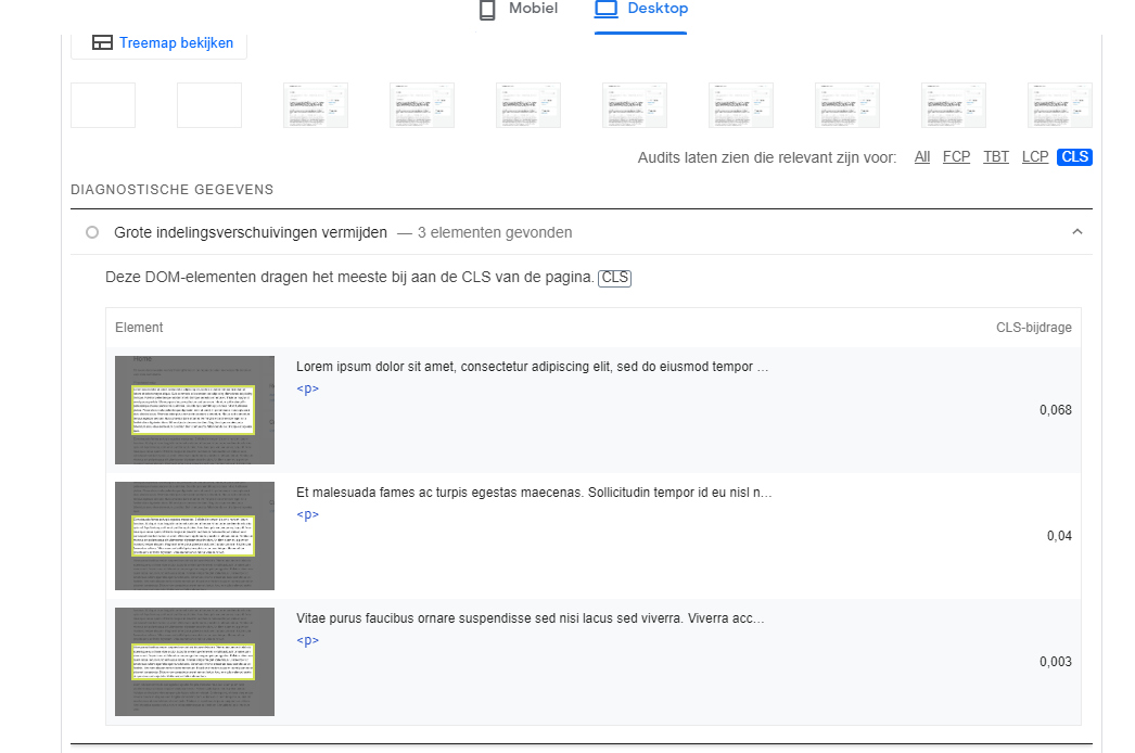
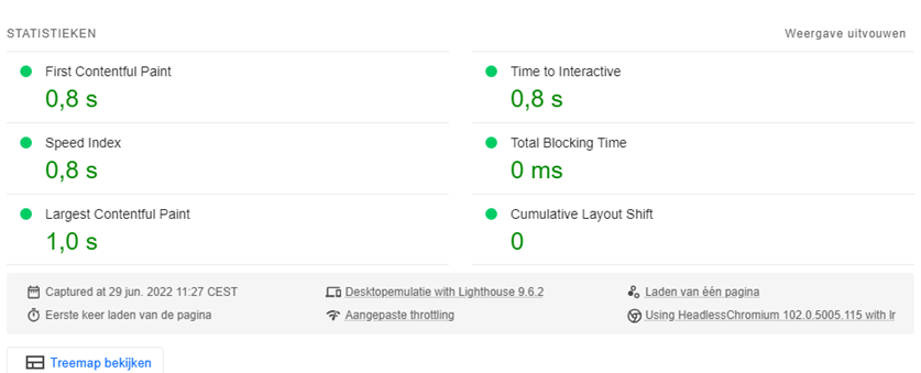
Recently, with a demo website, we came across a low score for CLS load times within the Google PageSpeed test. In this blog post we are going to explain what exactly this is, and how you can fix it for your website. After all, this is a fact that has direct impact on not only your load time, but also the usability score and therefore also has a direct impact in your Search Engine ranking. Therefore, in this blog, let's determine where these pain points can be found. And how you sometimes have to make painful decisions to solve them.
Why are these scores important?
Every webmaster should make his the best version of his website available to his users and visitors, with improvements in the website itself and its technology. Not only do you ensure a more pleasant user experience, but this can also have a direct impact on your conversion rate and your ranking within Google. Everyone will be familiar with the Google search engine and will want to see their website rank as high as possible on relevant search terms.
But unfortunately, this is not that simple, as Google takes into account more than 200 factors in its algorithms to determine who gets to the top. With the latest Google updates to its algorithms, more and more attention is also being paid to a website's usability score. So it's up to you as a webmaster to get the best results for this.
What is Cumulative Layout Shift?
Cumulative layout shift is the shifting of elements while the page is loading, so while a user clicks a button or item somewhere to continue, this can cause a mis-click. And therefore harmful to the user experience. Personally, I have seen the worst scores of this when using wide elements, ads and, for example, the cookie entry. You can't apply a direct solution to everything, because these are third-party sources or actions. So always be particularly critical about which parties you allow access to your website and hosting. Whether these are advertisers, affiliate links or banners or otherwise.
Cumulative Layout shift for this reason also has a separate score for both mobile and desktop, with a different screen size you naturally have a different appearance of your website. This is also taken into account in this score.
PageSpeeds shows you where the problems lie
There are a lot of options available for speed testing your website, tools like GTmetrix, Pingdom tools and PageSpeed insights are all good options. The most important one, however, is of course Google PageSpeeds. However, GTmetrix and Pingdom tools are indispensable if you want a second opinion or want to test the website from another location. It is also a good thing to occasionally ask customers or visitors with whom you have already built a relationship to ask how they find the experience. That way you have a real world opinion in addition to the hard number scores.
To see exactly where the problems lie within Google PageSpeeds, follow the test results and then select the following link to view the results.
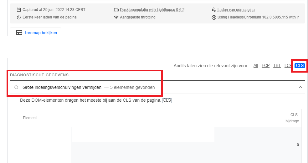
After this you will see exactly what elements these are and what you can do about them. Let's cover how to fix this for your website below.
Cumulative Layout Shift troubleshooting
So to actually fix the problems with the display, as shown in the image above, you will need to take a quick look at which elements are having the biggest problems. For the rest, it's just a matter of checking where else these elements are managed directly. With websites like WordPress and other Content Management Systems you may not have an easy option to edit for this. But that you have to look in the theme files.
In my example, the problem was limited to an element or widget which was always located on the right side of the website. Here was an option (double) to look again at the categories and latest articles. However, I also had this in a left menu which only becomes visible when clicked. So I decided to remove this entirely, as I could not manage this element or widget directly in my theme. Only on or off. To get a higher Google score, this was worth removing to me. And in addition, in the main menu which is always in the header of the website, I added some more functionality which before I only had on the right side.
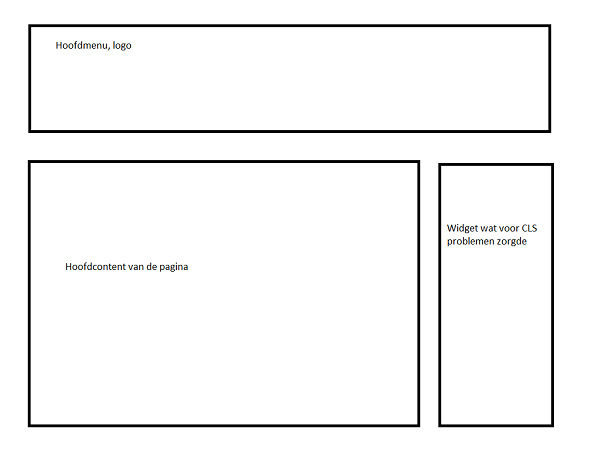
So that way you can always slide in the functionality of your website, and the elements that you have in view. There has to be a balance between what provides the best results in performance within the various speed tests and what is also achievable on balance. You'll see the best scores if you turn off all your ads, but the direct consequence of that is that no more revenue will be brought in through that.
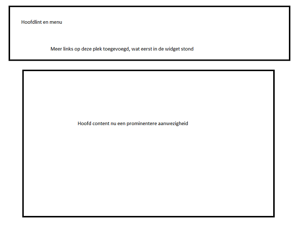
So it will always be a good critical look at what functionality that is nice to keep, and functionality that is indispensable for your website. And to make the choices in this.
Want to stay up to date with all our tips? Then follow us on Social Media to stay up to date with the latest news!
